
established since 1995, Soupy's had built strong recognition within the community. The challenge was to create a visual identity that felt nostalgic, approachable, and recognizable while introducing a more cohesive system that could support future growth.
primary objectives
- Modernize the brand without losing familiarity & authenticity
- support future growth & franchising
- Capture the history & warm personality of the soupy's experience
Research
- Observed restaurant environment
- Reviewed competitor landscape
- identified existing brand equity
- Analyzed business expectations
Key Insights
1. soupy's strongest asset is its existing customer loyalty.
2. Soupy's unique drive-thru-only model creates a distinct market position.
3. Future growth requires a more cohesive and scalable brand system.
concept development
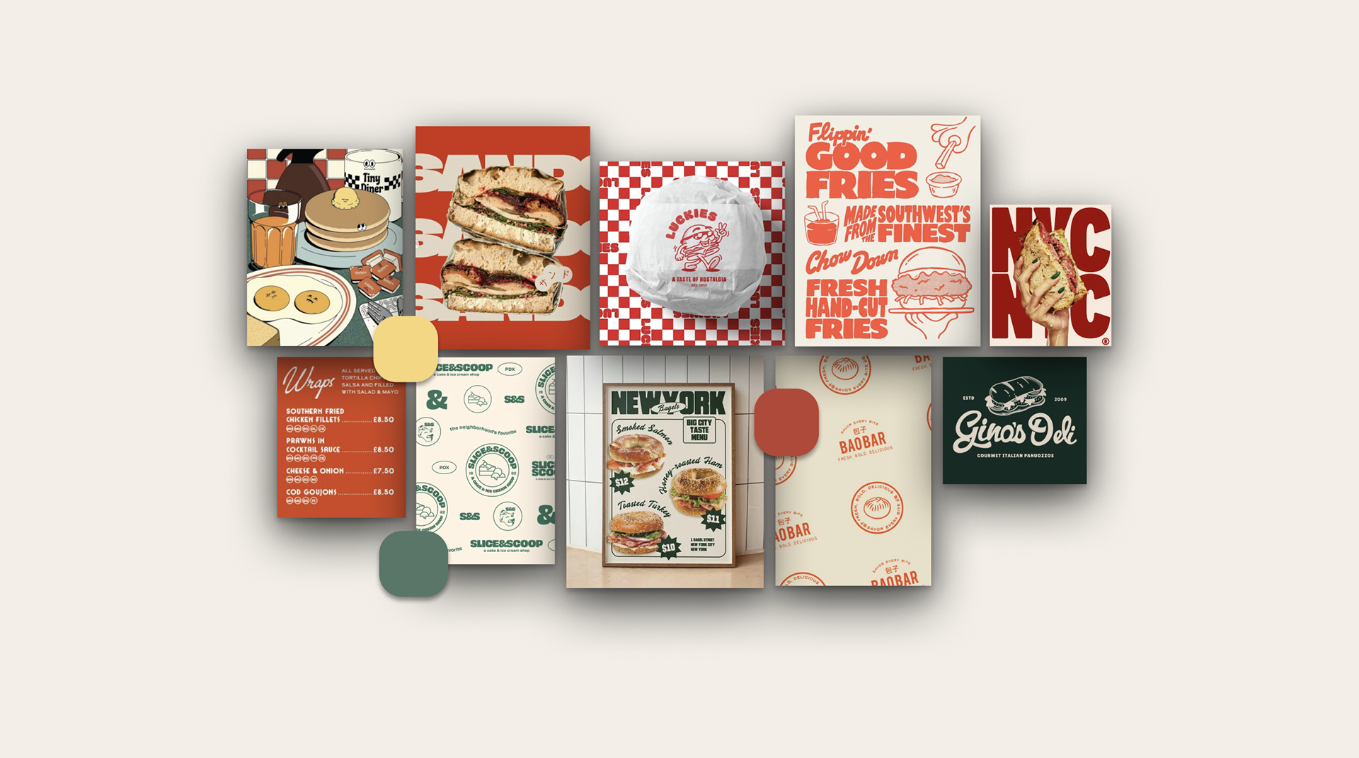
Family-Friendly | Wholesome | Timeless | Inviting | Nostalgic | Modern
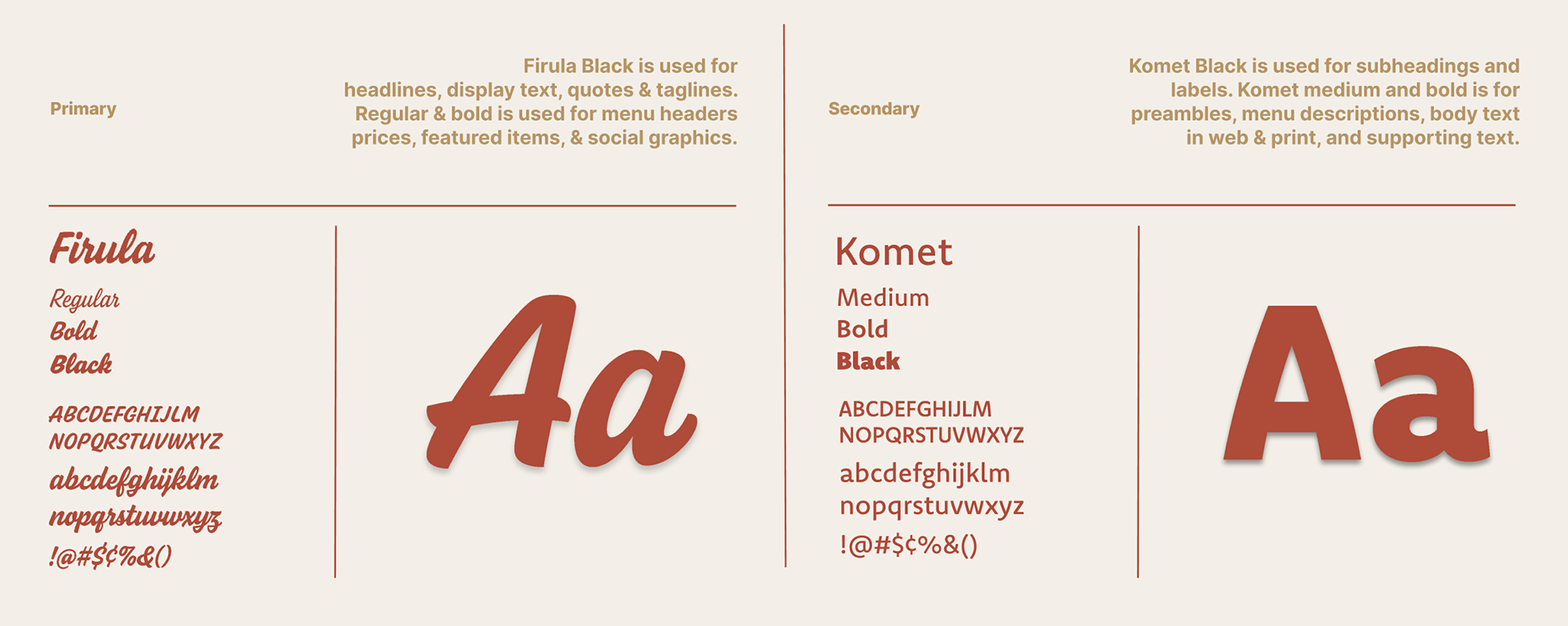
the moodboard was inspired classic diners and homemade comfort food- vintage comfort with a modern twist. the script logotype introduces a sense of nostalgia, while modern supporting typography and a refined color palette help create a more cohesive and versatile brand experience.
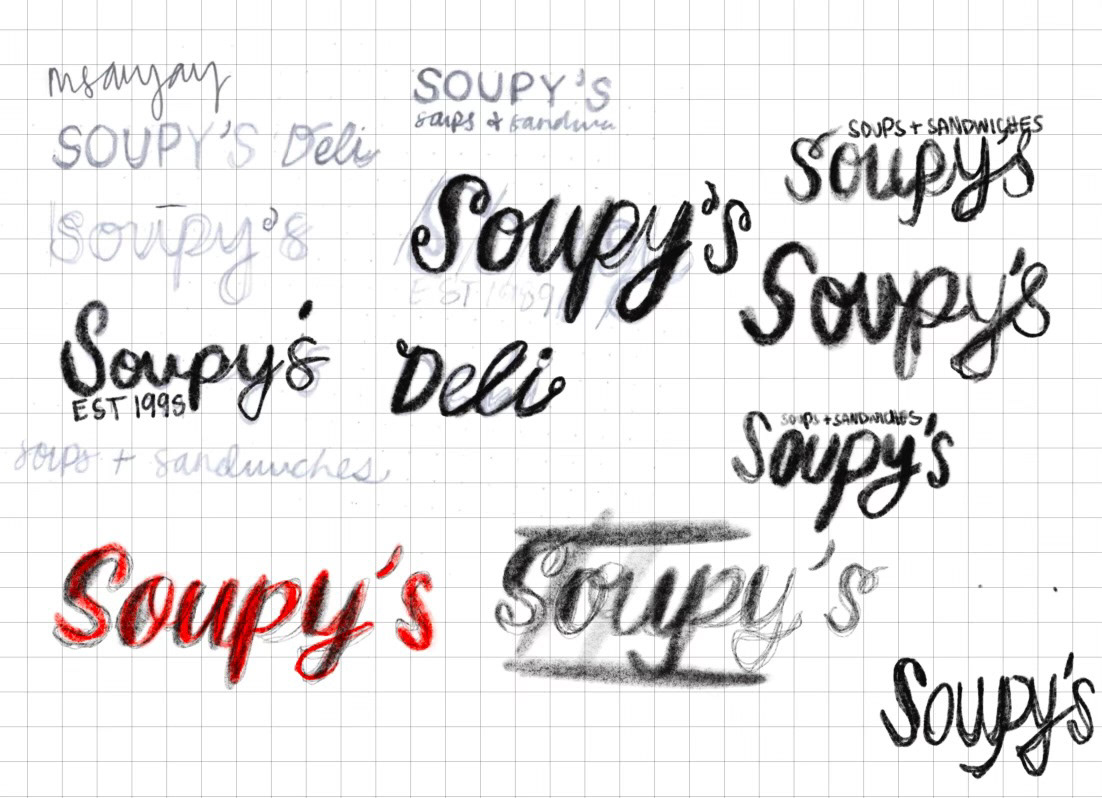
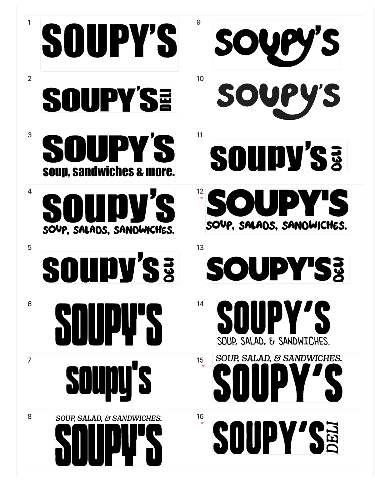
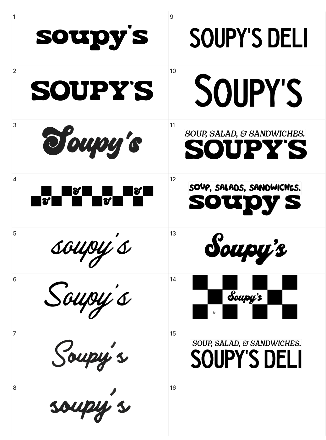
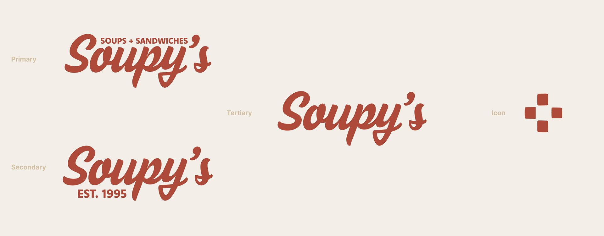
the original Soupy's logo wasn't script-based. however, I wanted to incorporate that script style somehow to evoke a sense of nostalgia and homemade charm. the final logo needed to incorporate a modern sans serif typography, so the end product felt traditional and bold.
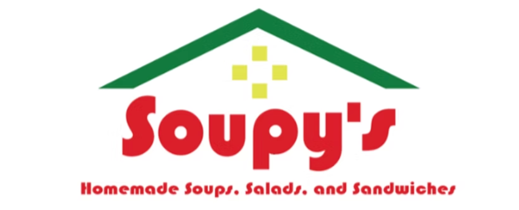
original logo
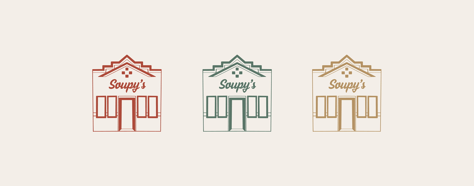
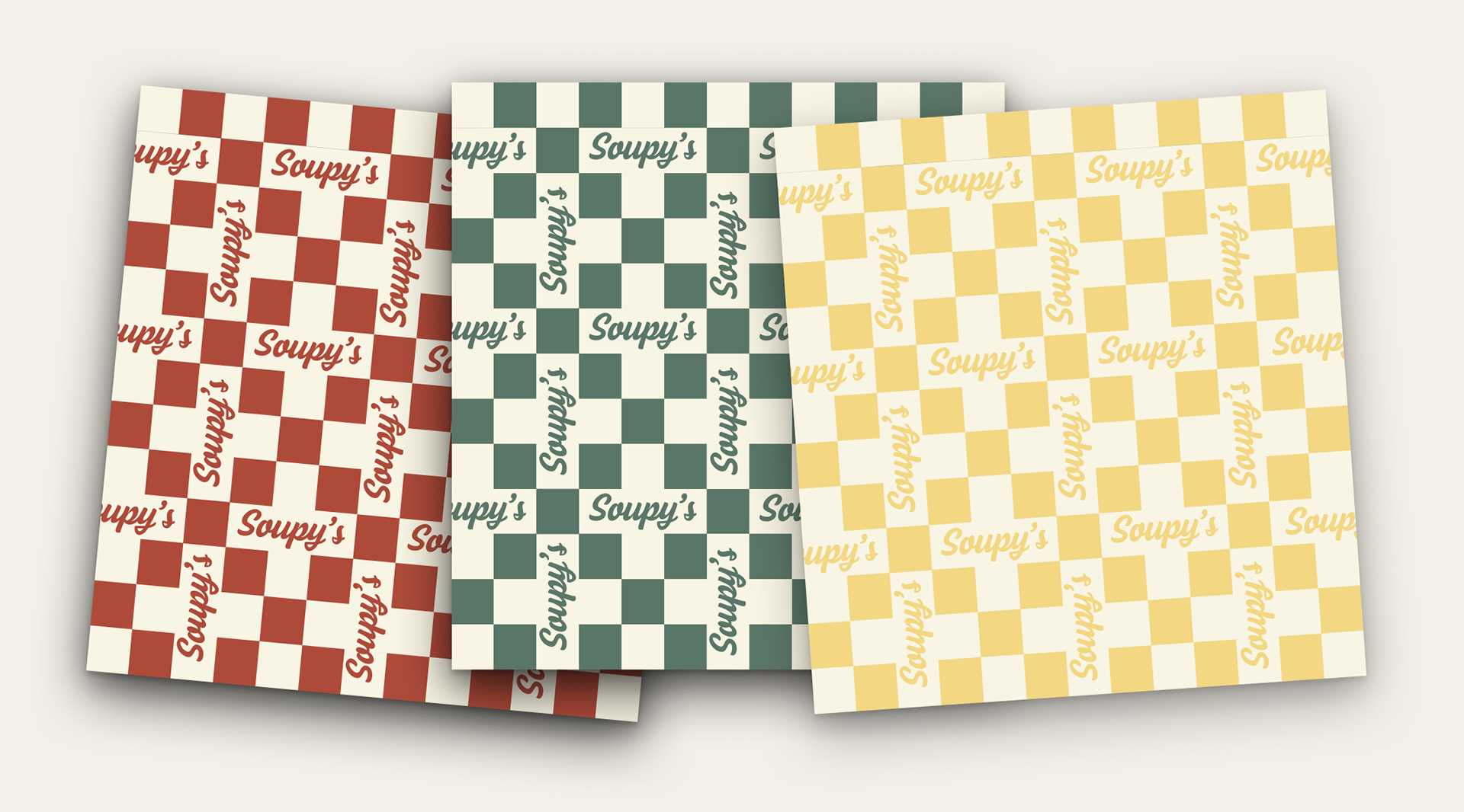
The identity was then built around the visual elements that already made Soupy's recognizable. The iconic four-square checkered symbol was also re-incorporated back into the brand system. I also created a custom storefront illustration to honor the primary location's history and presence within the community while supporting the brand's potential future expansion.
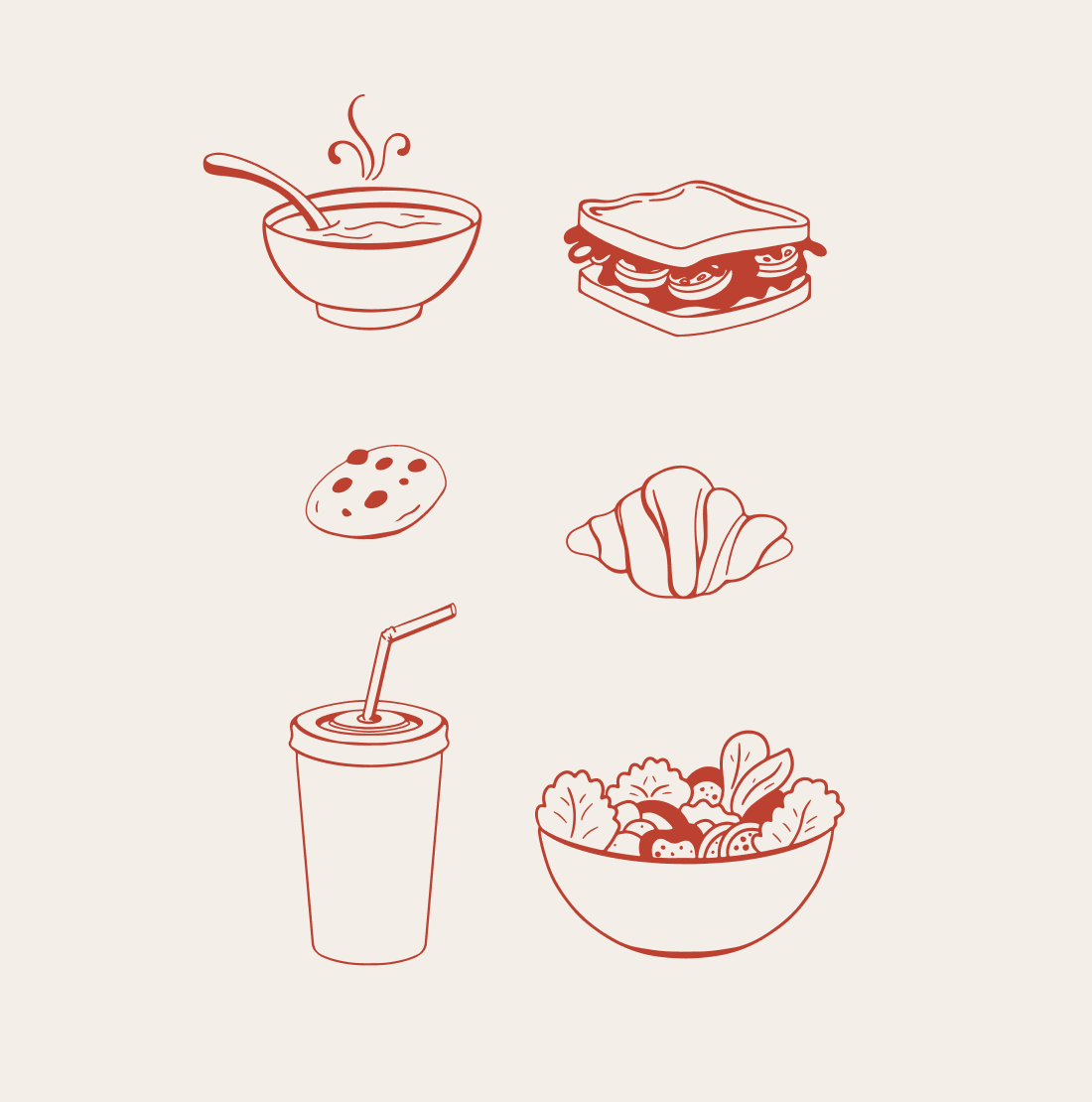
i developed a few more custom illustrations to highlight some of Soupy's menu items. this introduced a more playful, family-friendly element to the brand. the illustrations create a flexible visual asset that can be used consistently across packaging, marketing, environmental graphics, and other future brand applications.
application
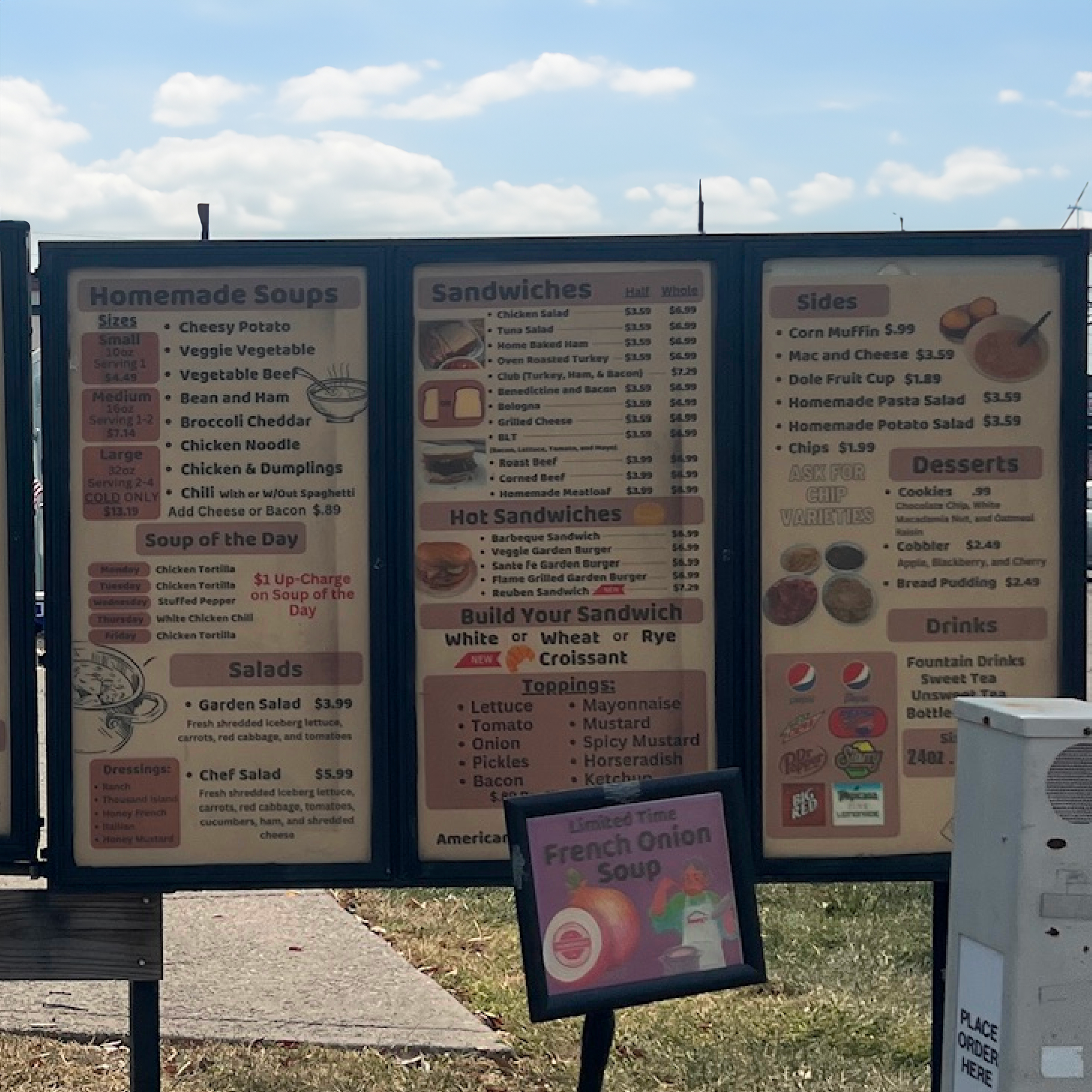
before (drive thru menu)
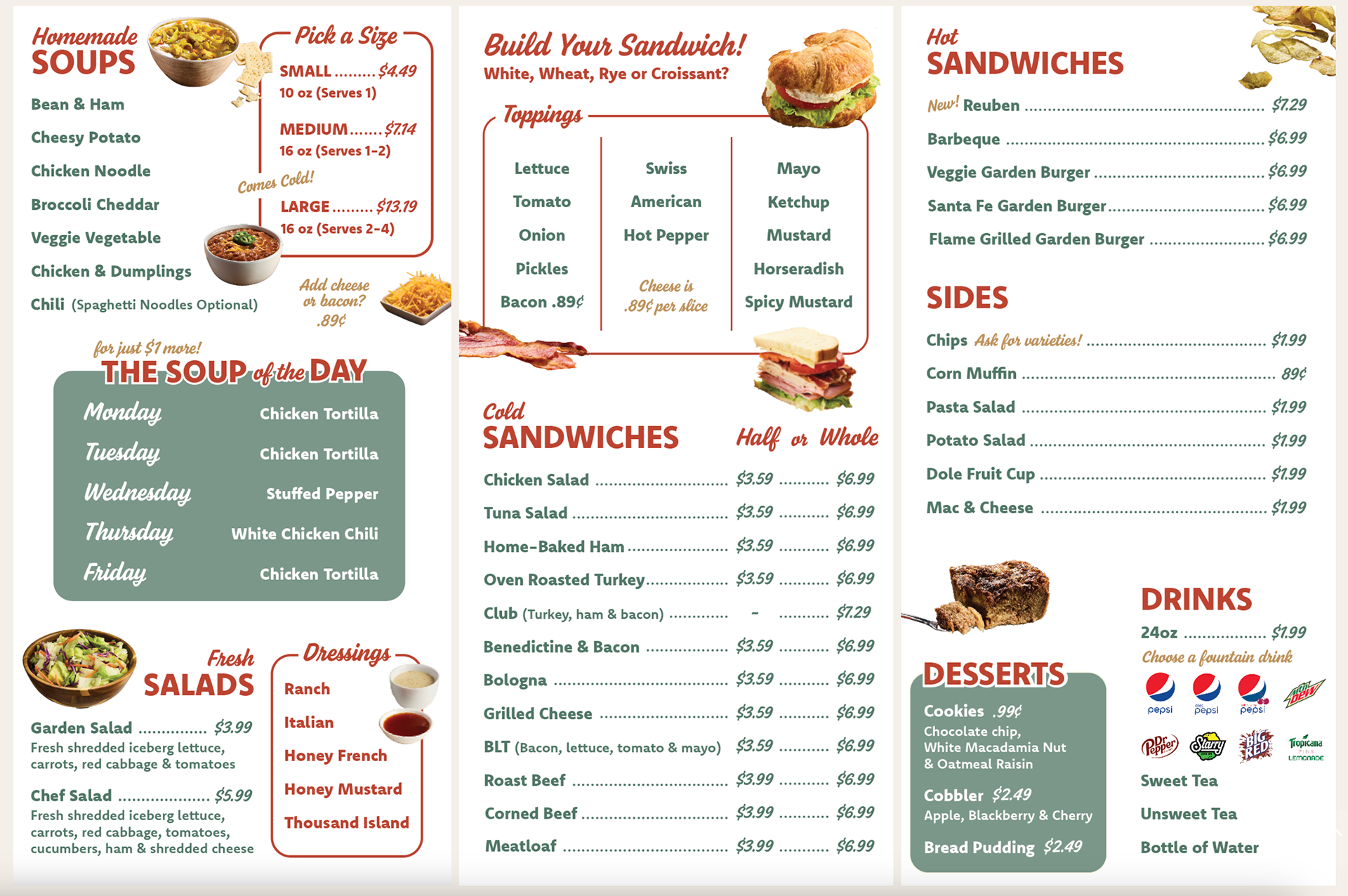
after (drive thru menu)
since Soupy's operates exclusively through its drive-thru, the menu was a critical part of the customer experience. the focus was improving readability, creating a brighter and more eye-catching presentation, and finding a way to highlight key offerings such as the soup of the day and desserts.
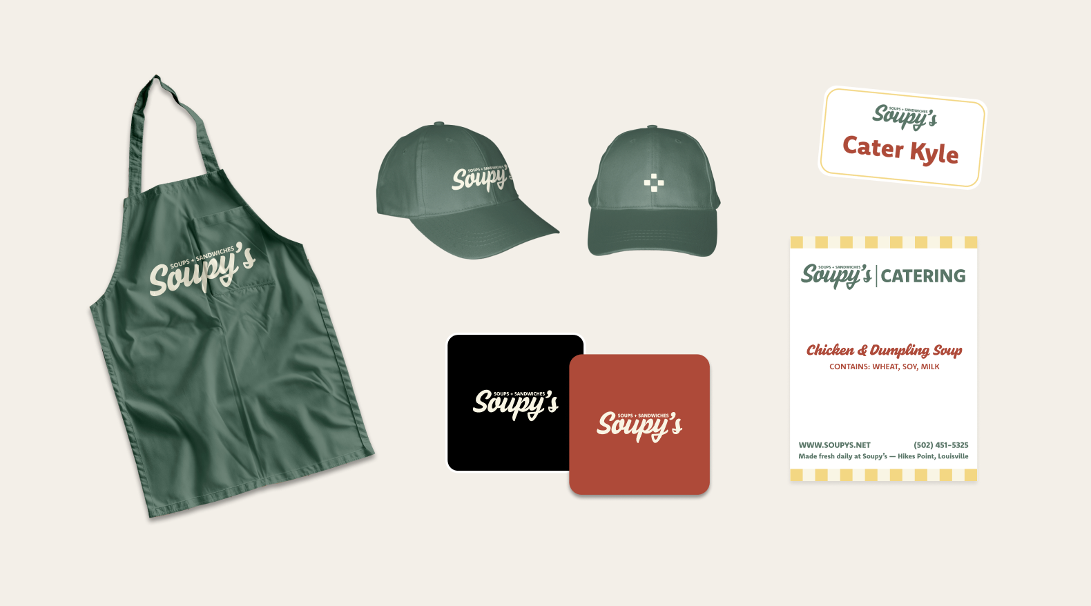
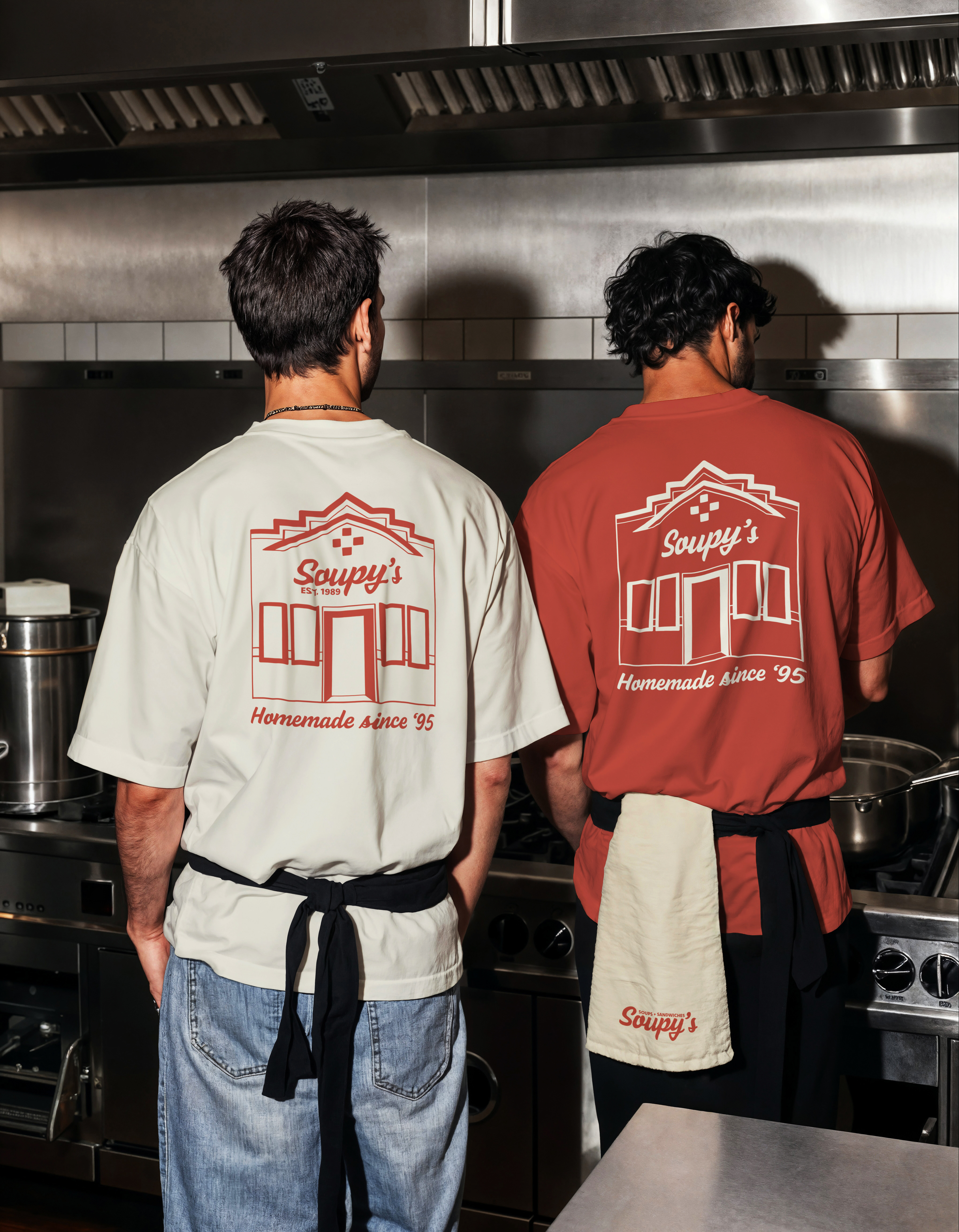
Extended the identity across multiple touchpoints such as apparel, packaging, catering materials, signage, and web to create a cohesive brand experience.
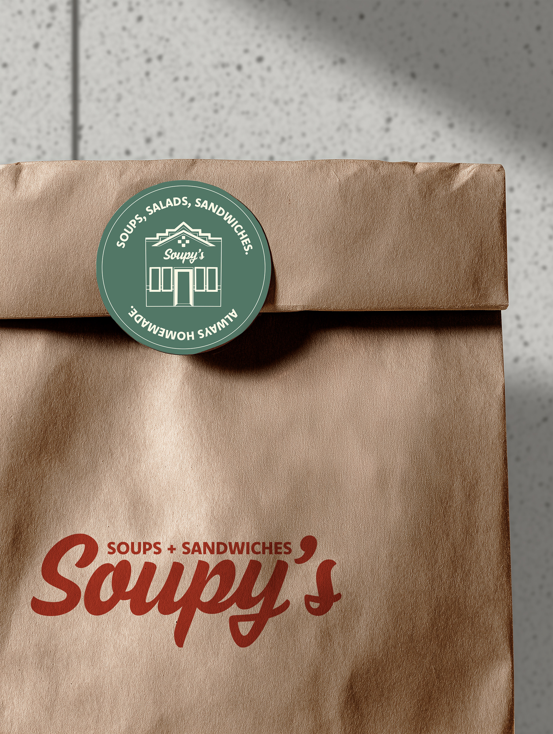
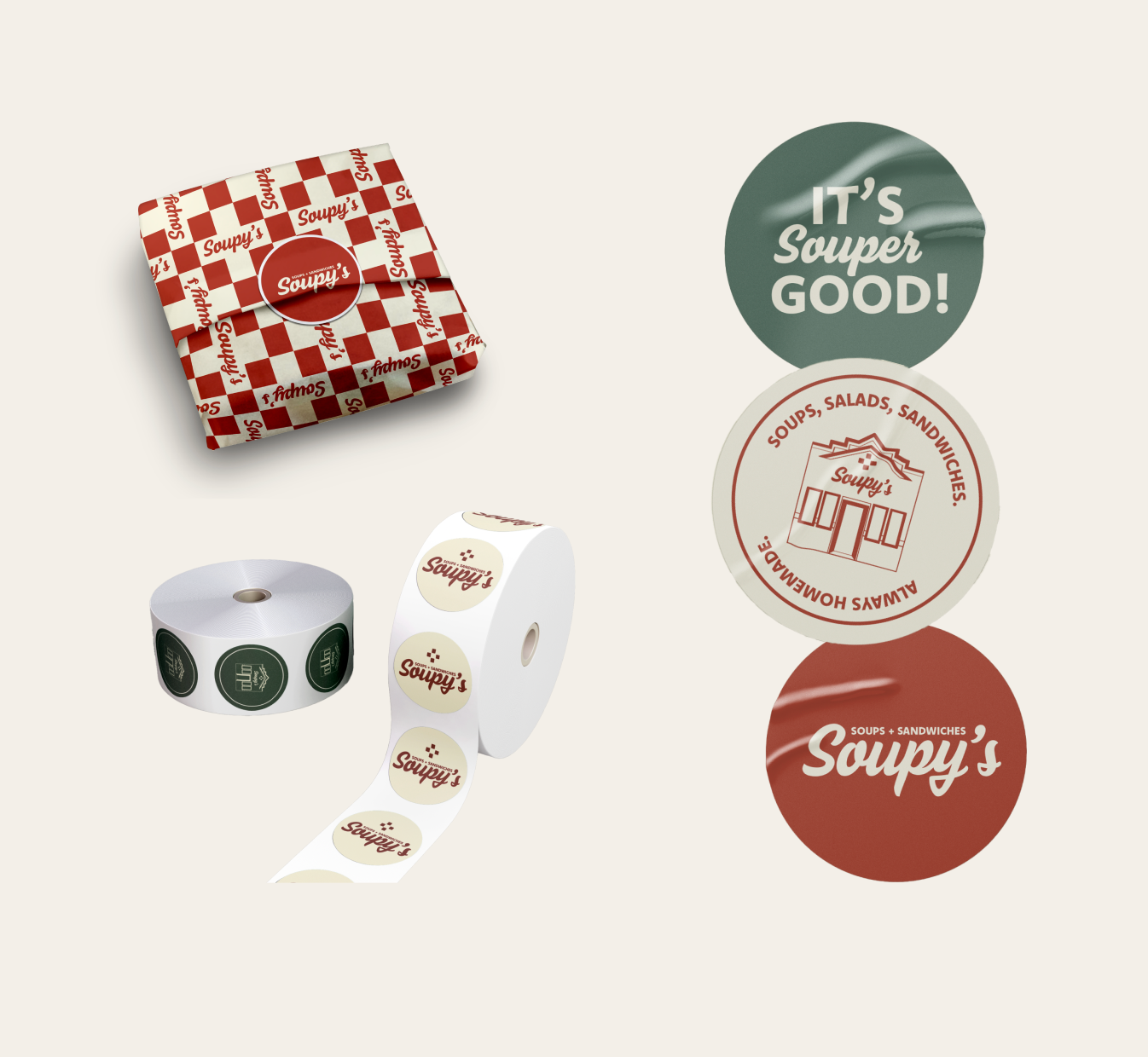
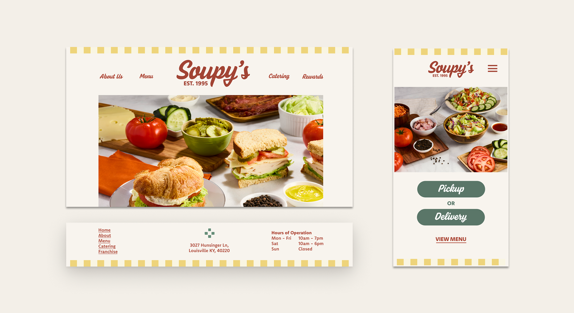
Not every brand needs reinvention. In this case, the strongest solution came from identifying what already resonated with customers and building a more intentional system around it. By preserving their recognizable brand while modernizing supporting elements, the identity stays familiar but refreshed. it's not always about redesigning the brand for today, rather positioning Soupy's for the next generations to come.
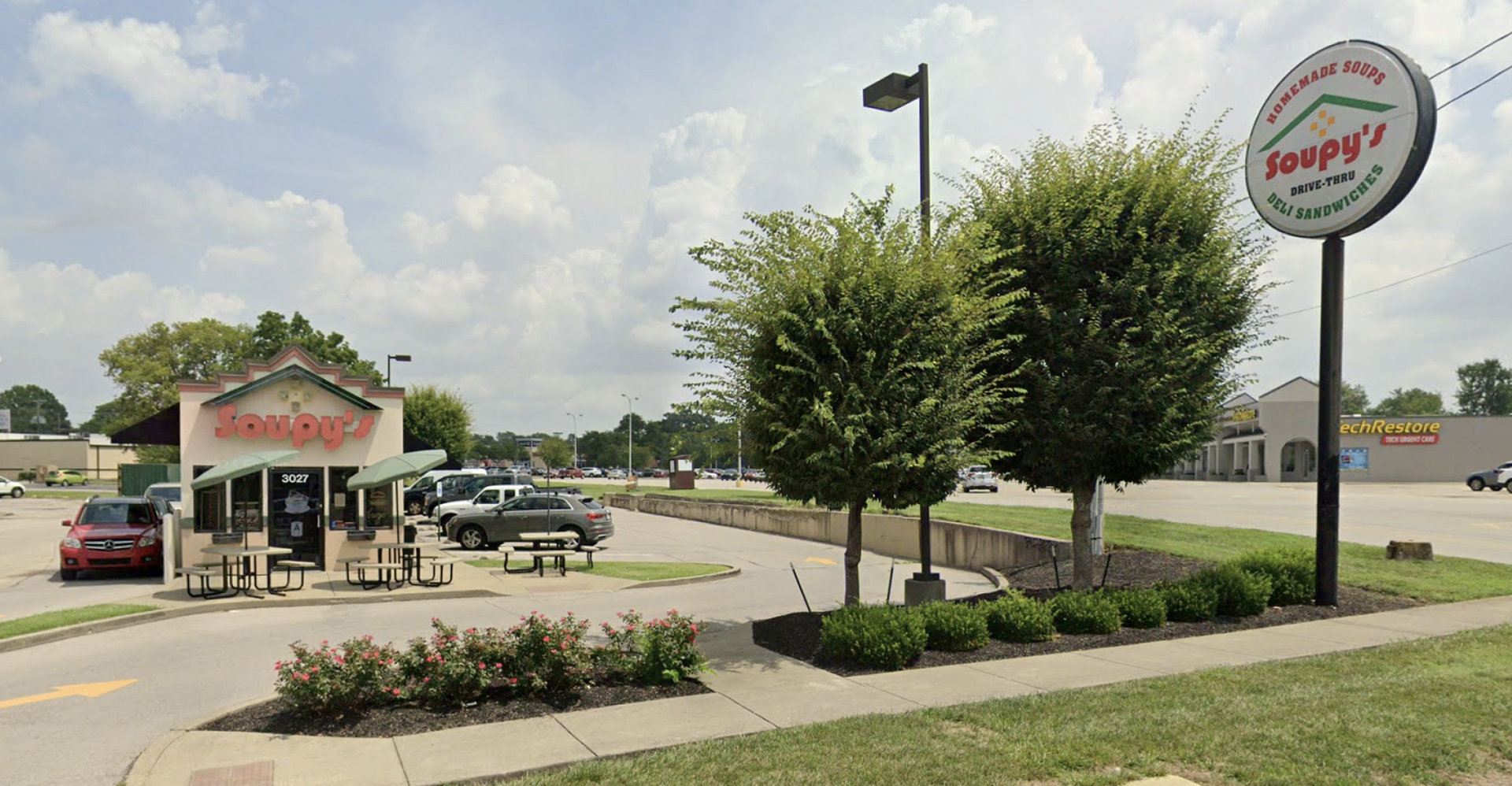
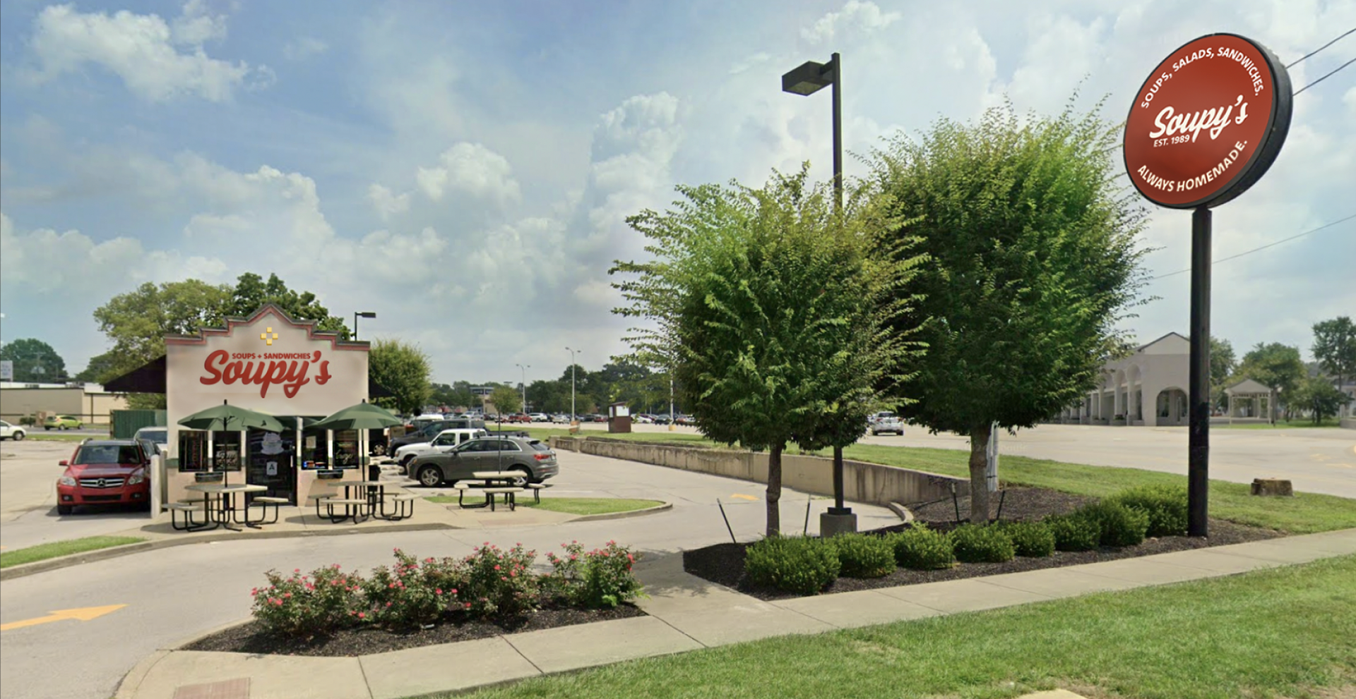
before (business front)
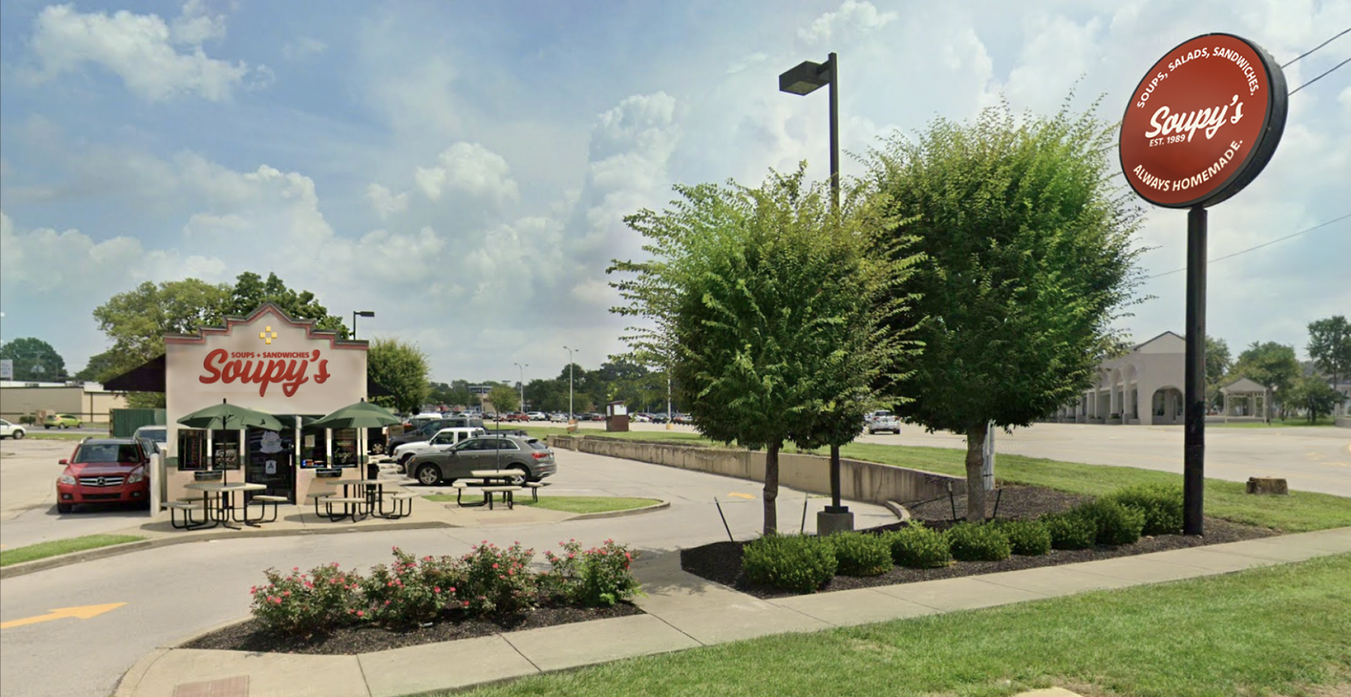
after rendering (business front)
this project was Completed during my time as co-founder at Togethr. This project showcases my individual contributions to the project.