Mamacita Lashes had an established identity and an incredible, growing customer base. The challenge was to preserve the brand recognition they had already built while creating a more intentional and elevated identity system that felt as premium as the services themselves and remained cohesive across digital and physical touchpoints.
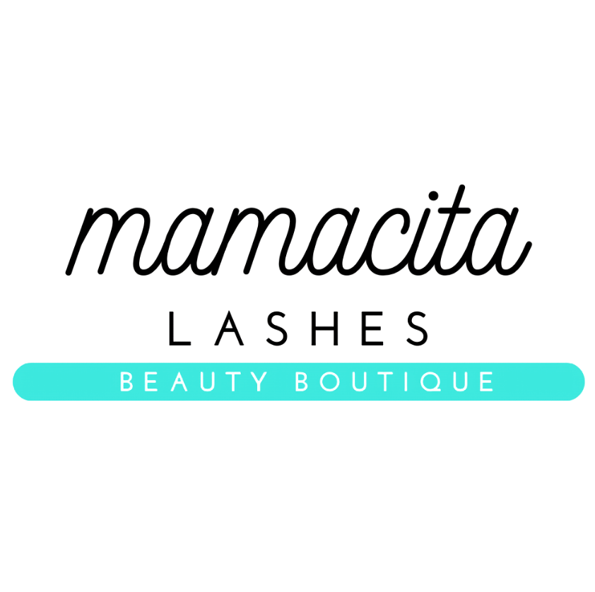
old logo
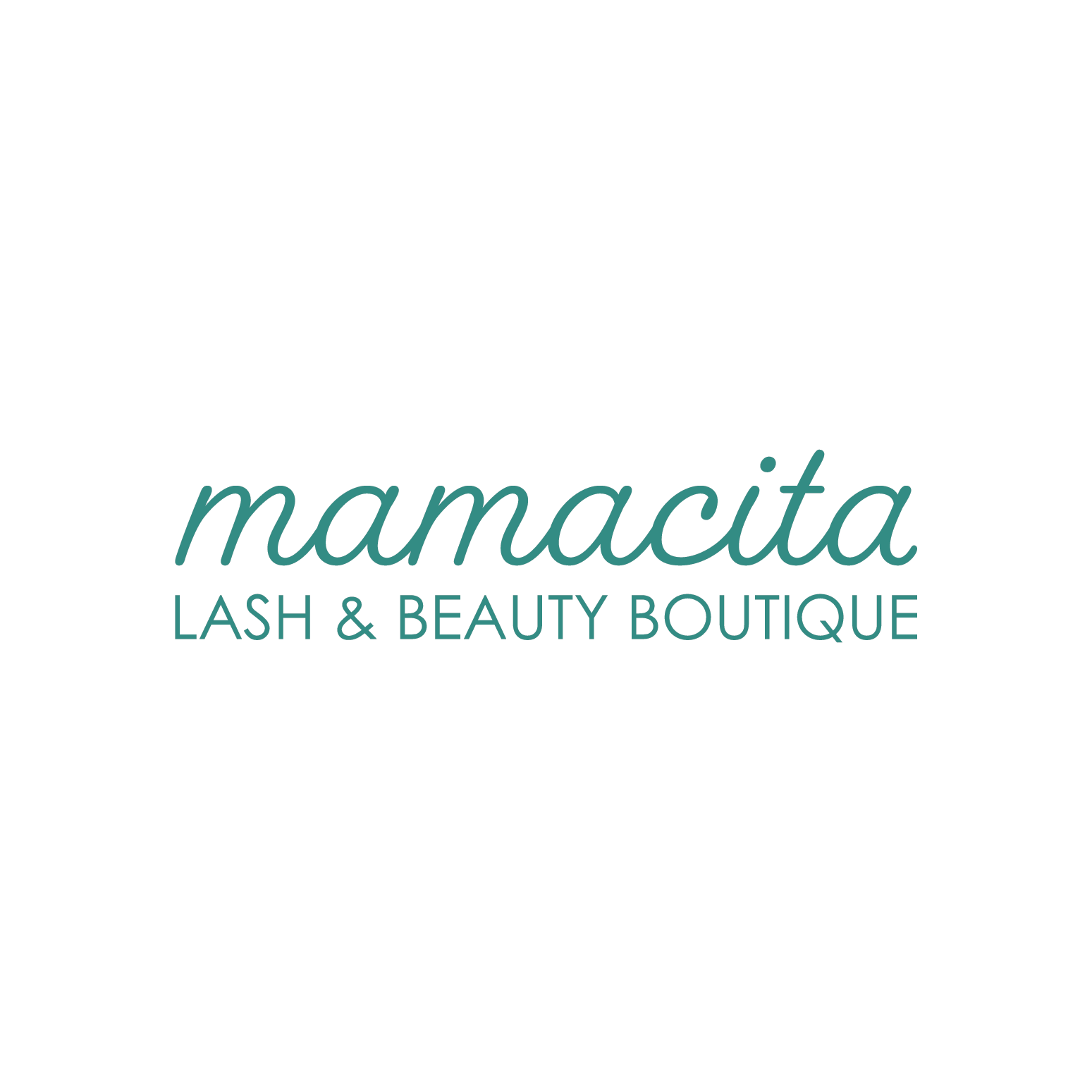
refined logo
The goal wasn't to reinvent the logo, but to refine it. I preserved the recognizable script while introducing a cleaner hierarchy that felt more intentional and aligned with the brand's growth.


the identity became more elevated with a refined typographic hierarchy, expanded color applications & custom illustrations of beauty tools. the identity is now scalable but still recognizable.
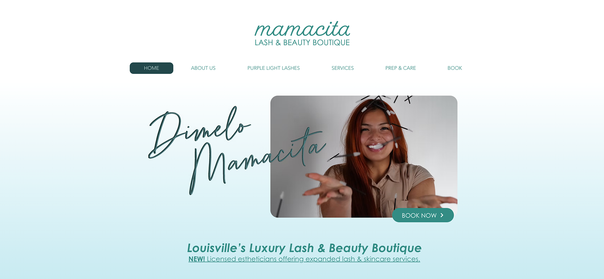
landing page
Created website copy for Mamacita Lashes' new "purple light lash" extension service. As the salon grew, the website structure expanded to incorporate additional beauty professionals and their services while maintaining a cohesive user experience and brand identity.
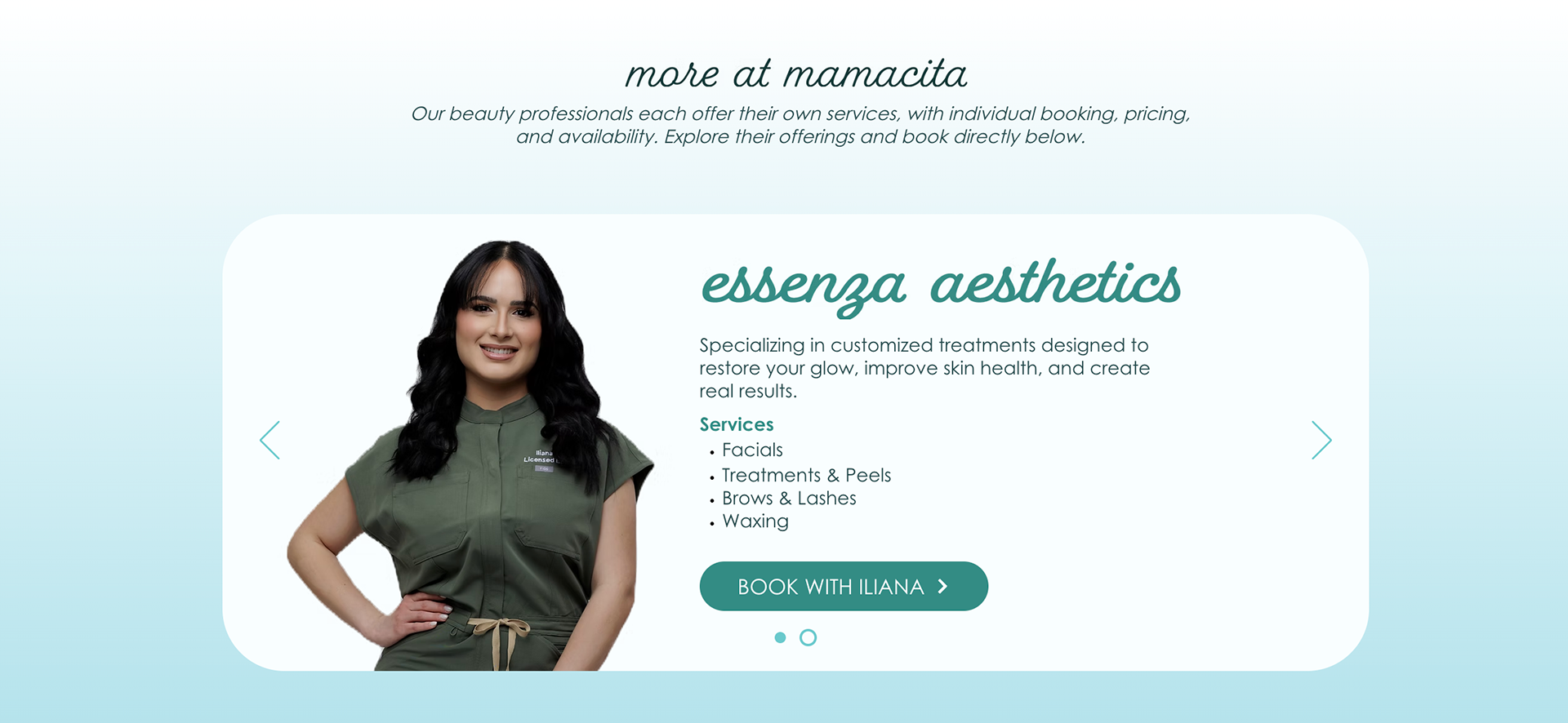
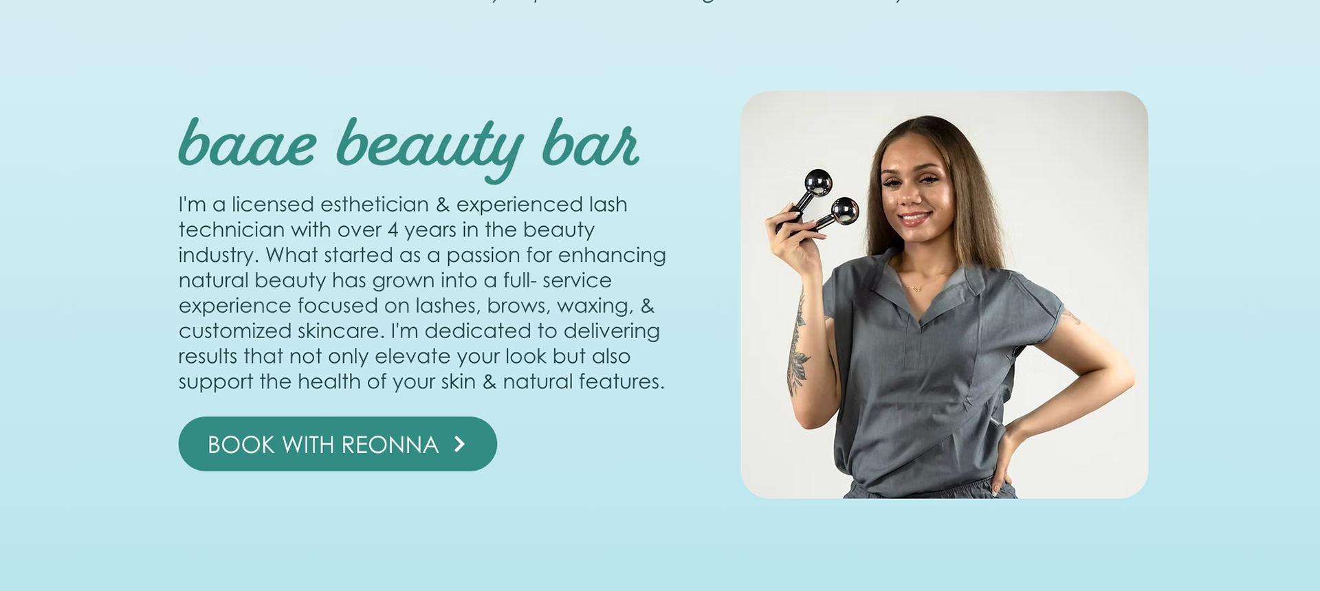
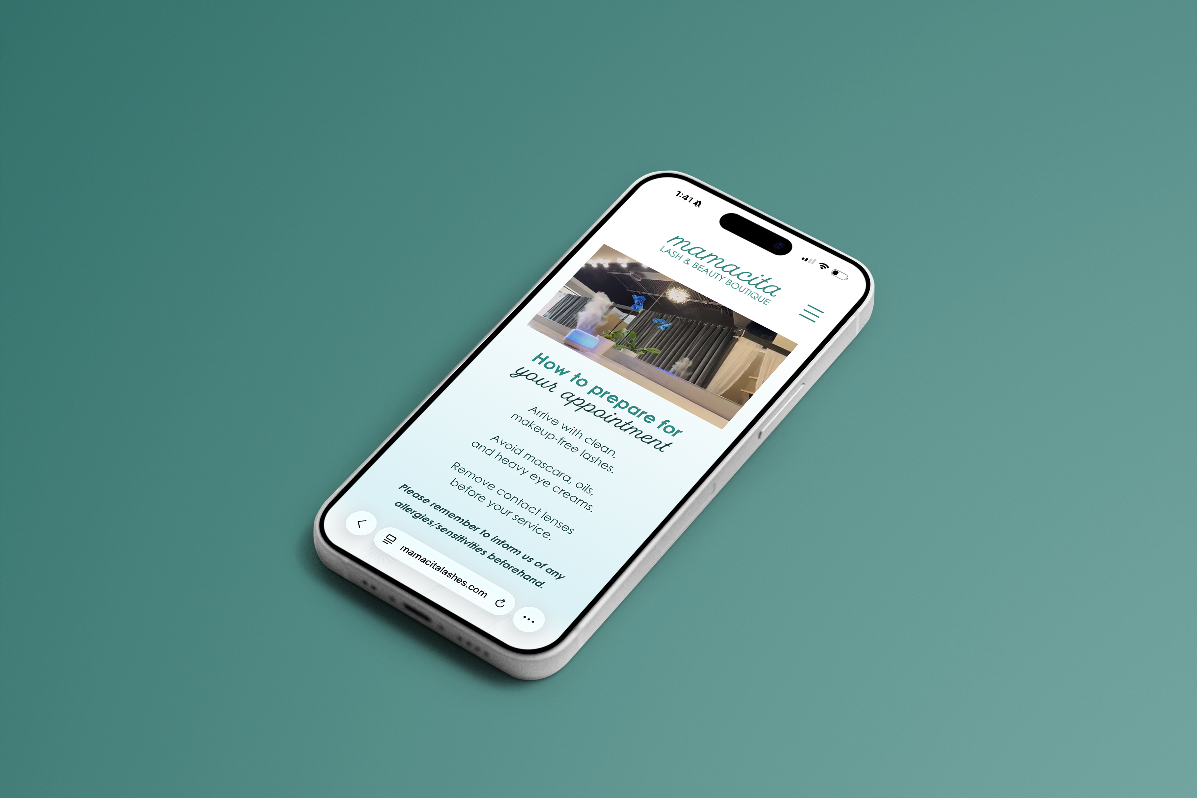
this website was Completed during my time as a co-founder at Togethr.