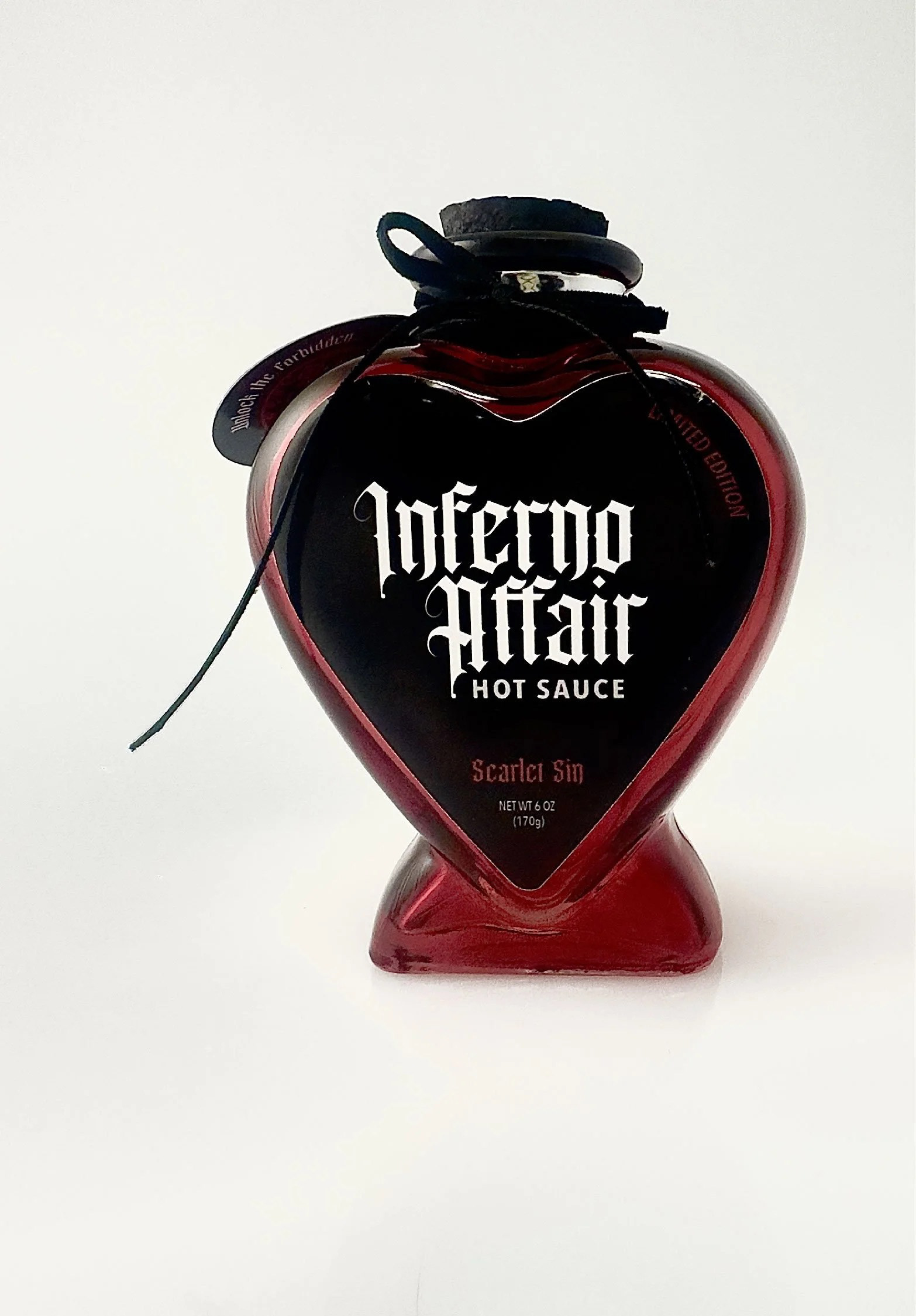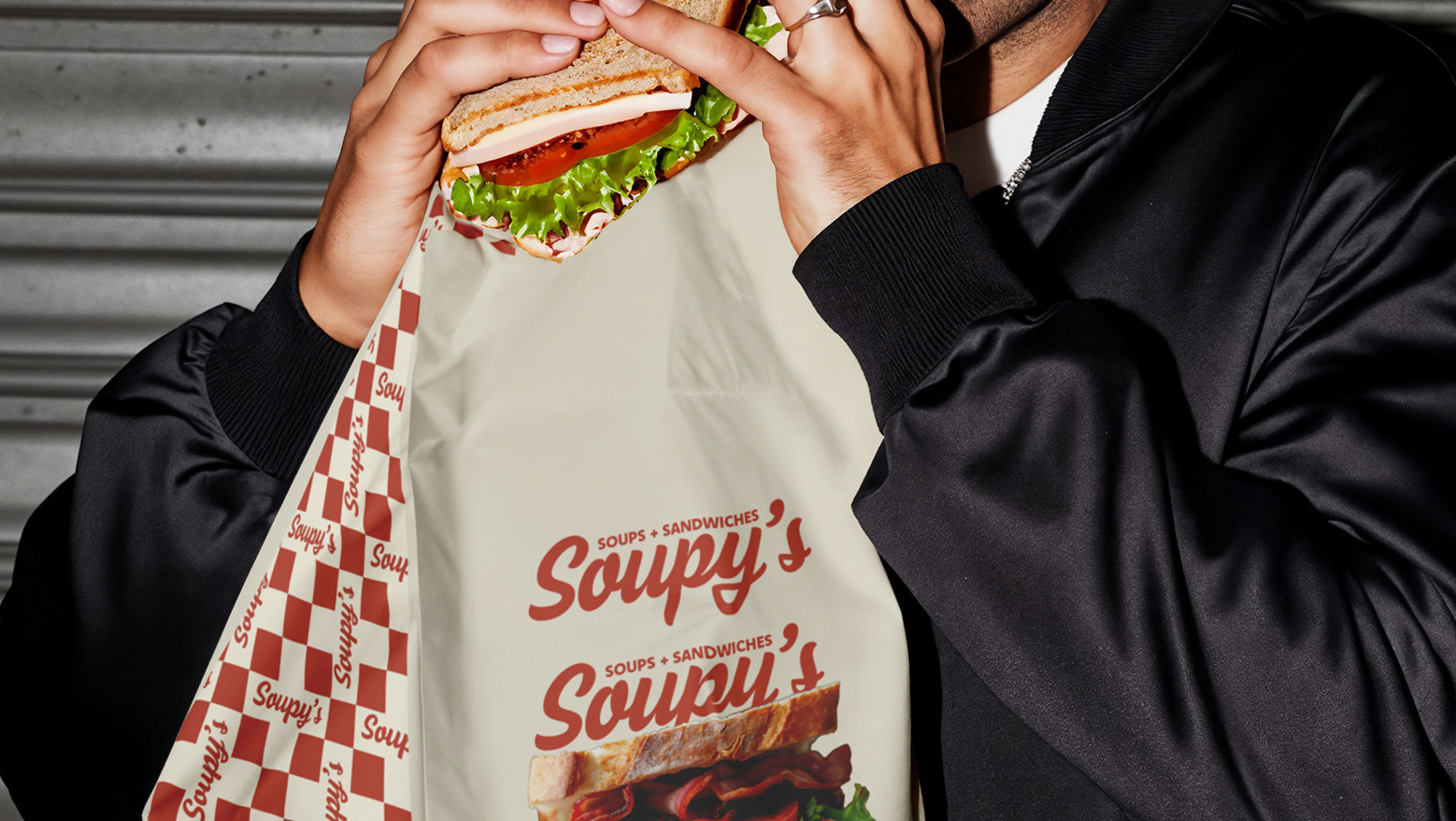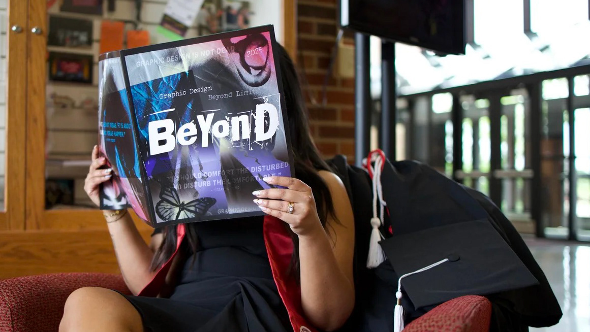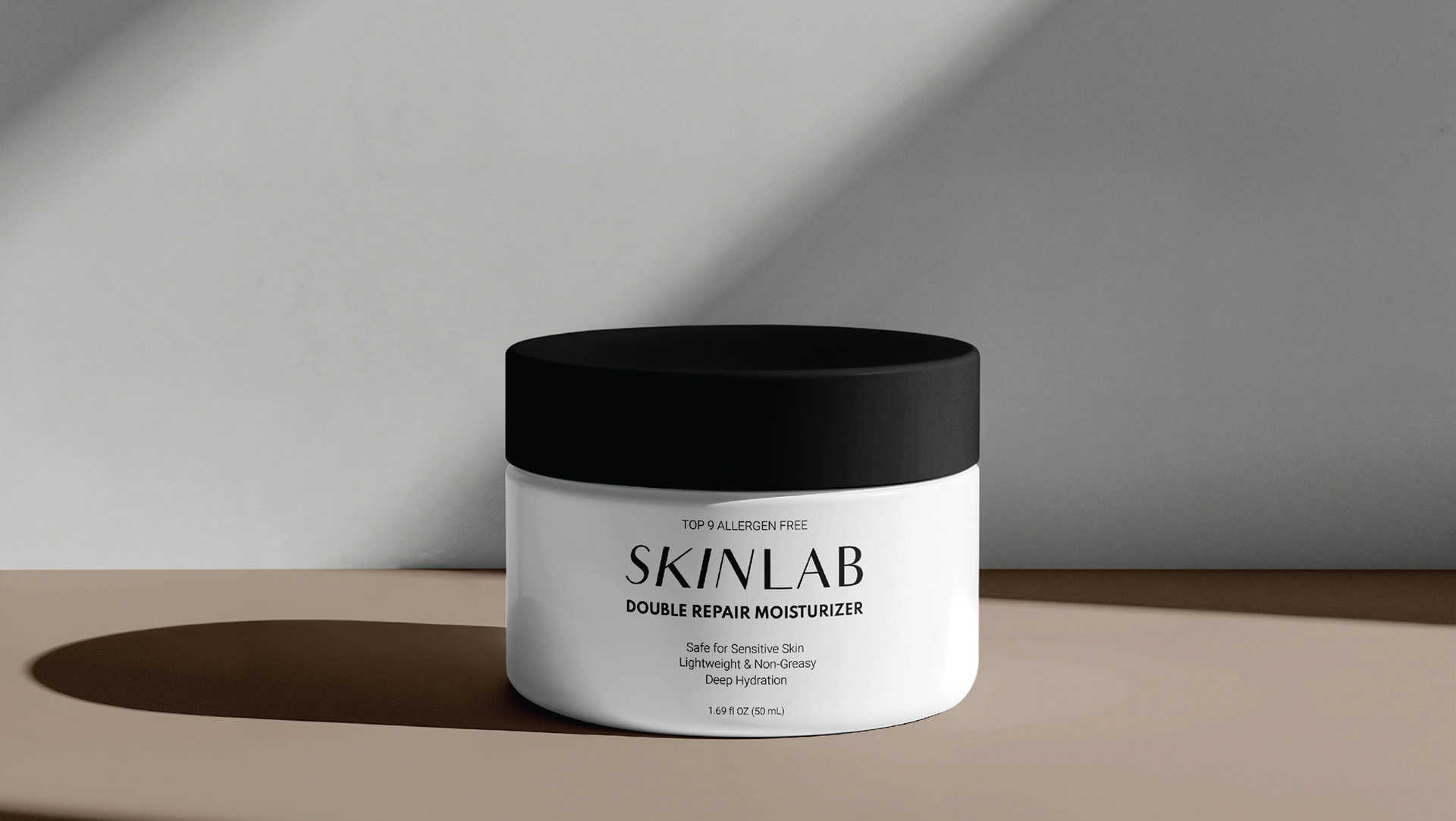

this is a hot sauce with attitude. Rather than following the playful or rustic aesthetic commonly found in hot sauce packaging, Inferno Affair embraces a moodier and more provocative visual direction. Drawing inspiration from themes of passion, danger, and temptation, the brand uses expressive typography as the hero element to create a memorable identity with minimal reliance on illustration. The result is a packaging system that feels bold, seductive, and impossible to ignore.
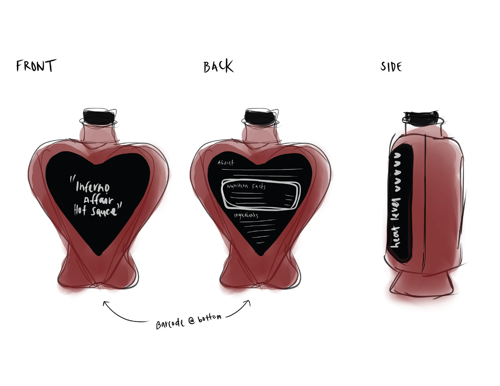
As part of the design process, I explored how the identity could translate onto an unconventional heart-shaped bottle. The shape introduced unique spatial constraints, challenging me to carefully consider typography, hierarchy, and label placement. These sketches helped determine how the brand could remain impactful while adapting to a non-traditional package format.
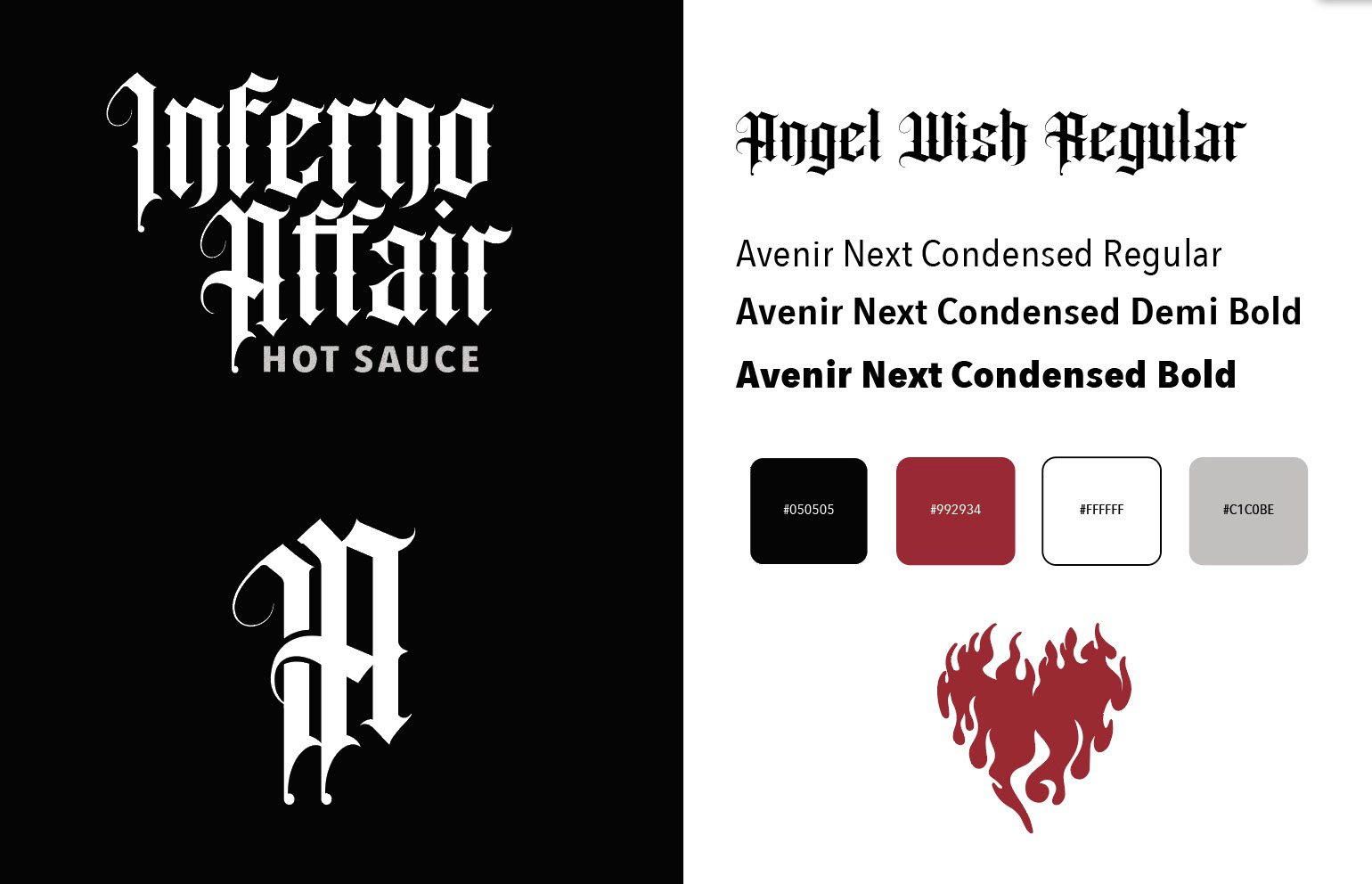
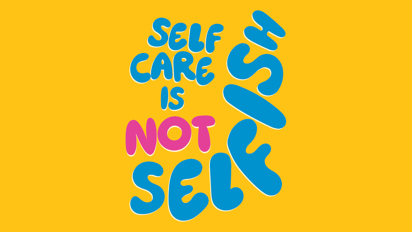
With limited graphics available, the success of the design relied heavily on typography. I used expressive letterforms, strong contrast, and a restrained layout to create a label that not only feels bold but memorable, and visually impactful. The final design demonstrates how typography alone can establish mood, personality, and shelf presence.
In addition to creating the visual identity, I gained experience researching food packaging standards and organizing required product information, including nutrition facts, ingredients, and regulatory labeling elements. This project reinforced the importance of balancing creativity with the functional requirements of real-world packaging design.
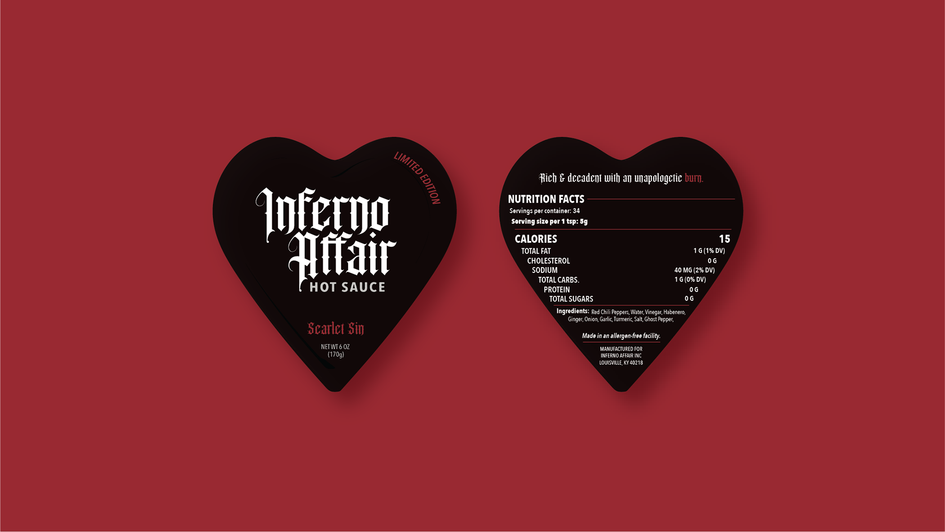
Front & Back Labels

QR Code (Neck Tag)