
Beauty shoppers are often presented with an overwhelming number of products, ingredients, and recommendations. With hundreds of options available across skincare, makeup, and hair care categories, customers can struggle to identify products that fit their individual needs and preferences.
The challenge was to create a more intuitive shopping experience that simplifies product discovery while encouraging exploration and brand engagement. At the same time, I wanted the experience to remain true to Sephora's iconic brand identity while also creating a more seamless & engaging journey for users navigating the platform.
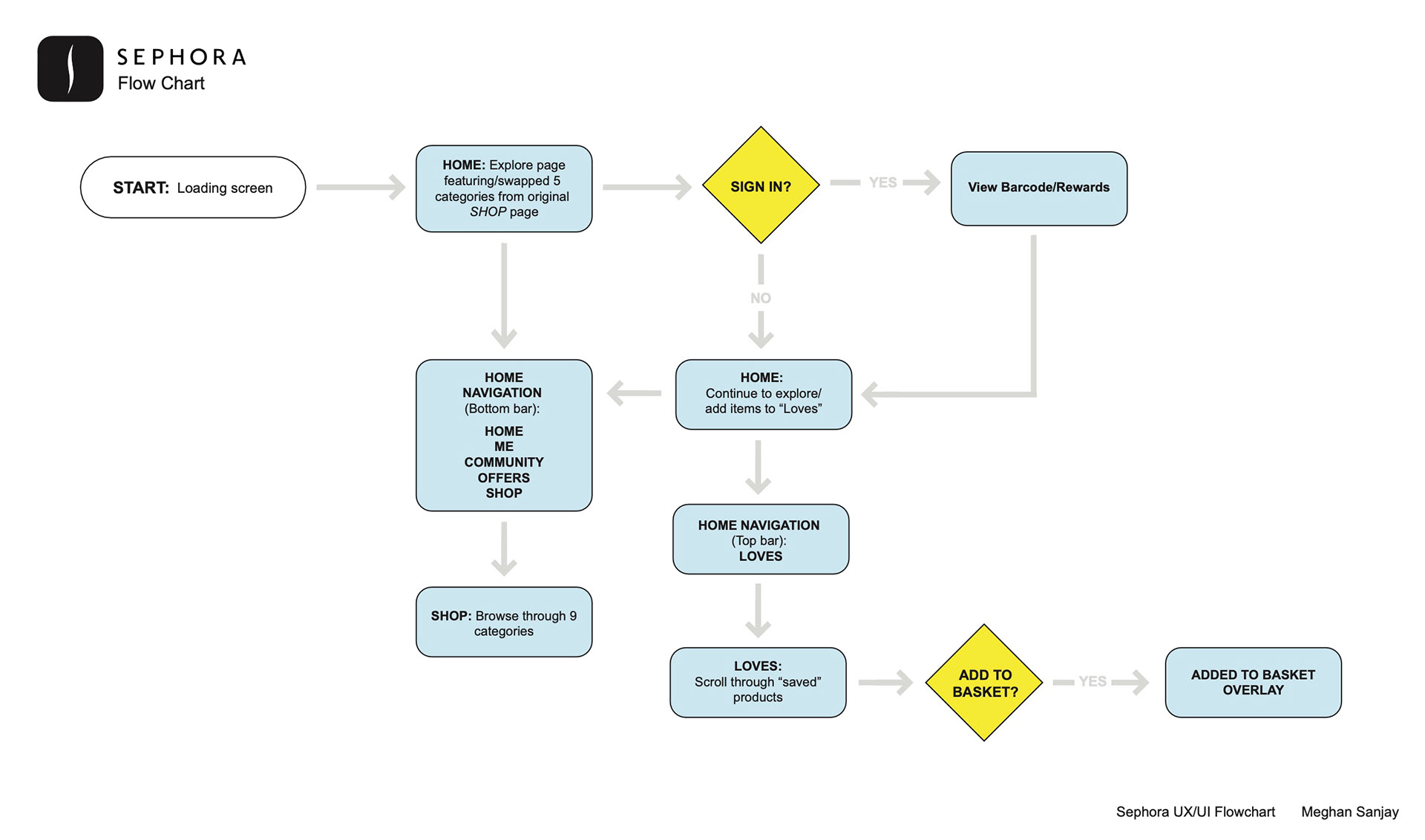
The user flow served as the framework for the redesign, helping define screen hierarchy, navigation structure, and key interactions before moving into wireframes and high-fidelity designs. This process ensured that design decisions were driven by user behavior and business goals rather than aesthetics alone.
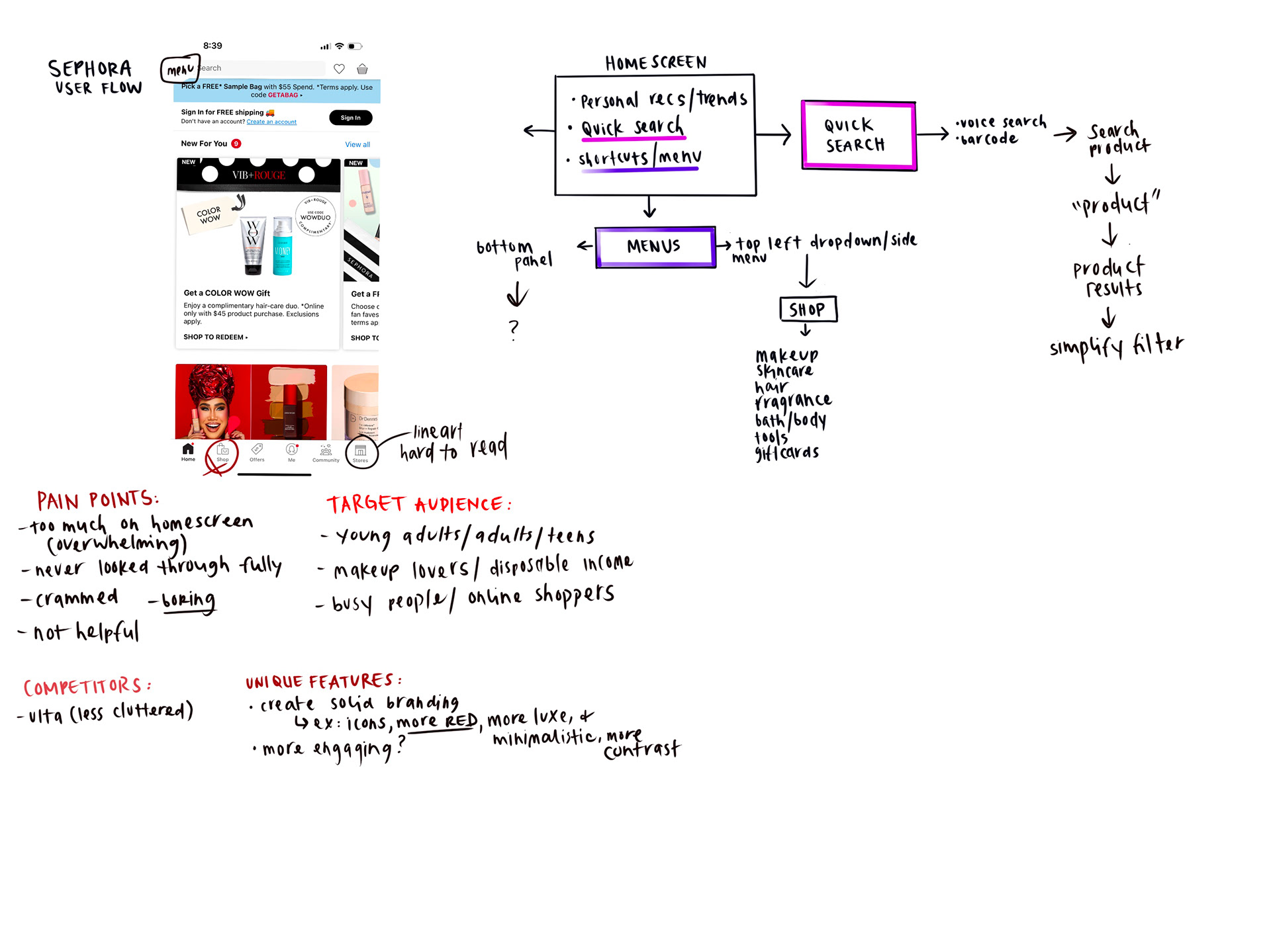
for the redesign, I conducted an audit of Sephora's existing app experience and mapped potential improvements. I documented user pain points, analyzed competitor approaches, and explored opportunities to create a more streamlined and visually engaging shopping journey.
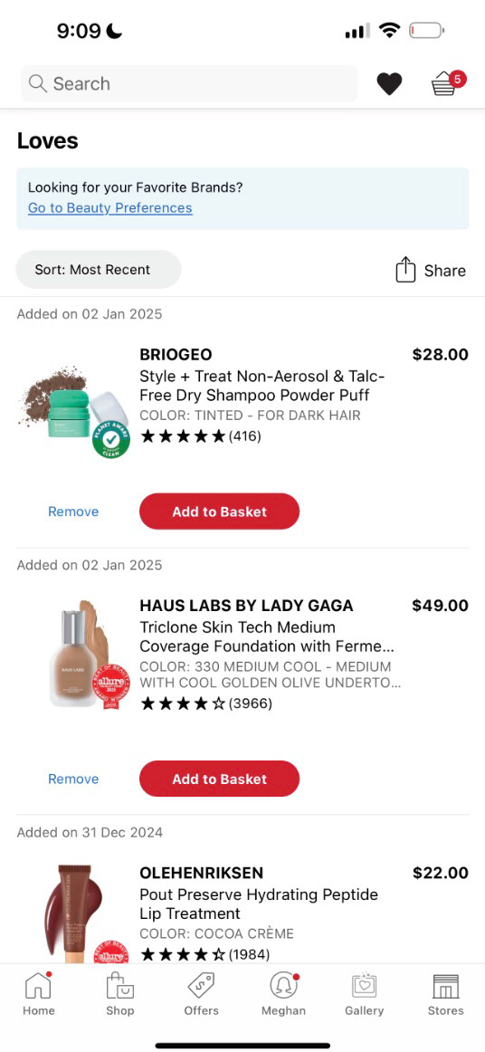
LOVES (Before)
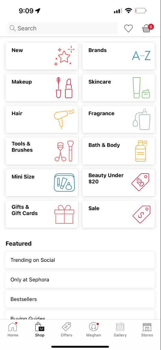
MENU (Before)
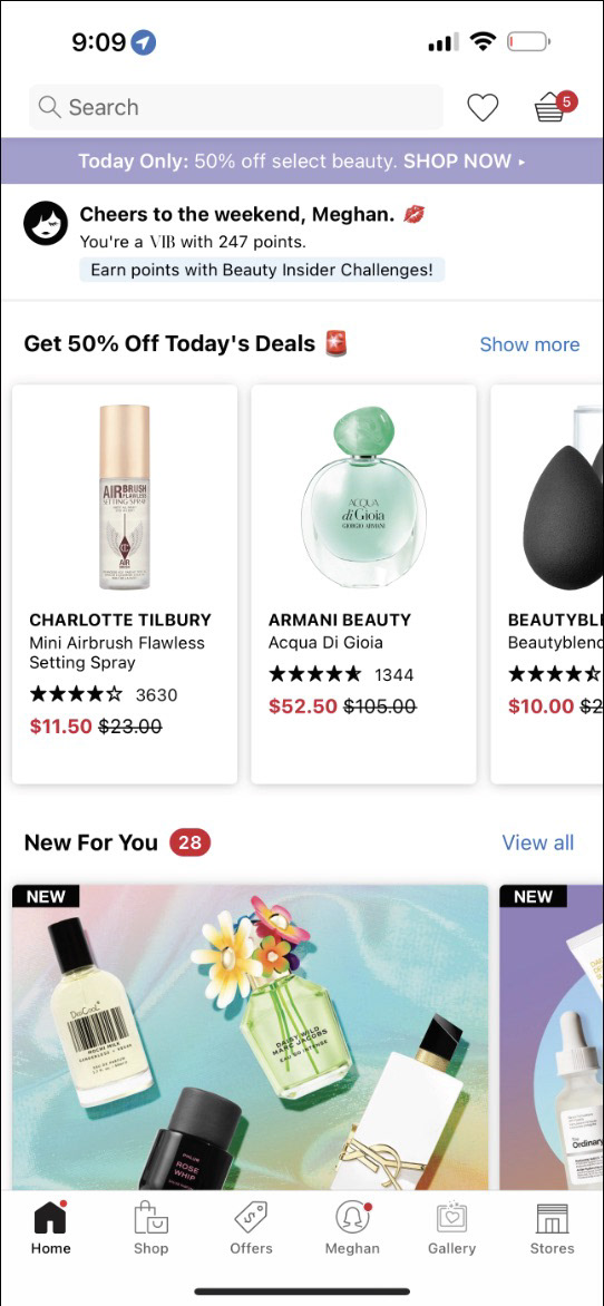
HOMEPAGE (Before)
these 3 images show the current or before of the sephora app. While Sephora's app offered extensive functionality, the interface felt visually crowded and difficult to navigate. The abundance of content, promotions, and product recommendations created a dense experience that often competed for the user's attention rather than guiding it.
Additionally, the interface lacked the strong visual distinction and premium atmosphere typically associated with Sephora's in-store and digital brand presence. As a result, product discovery felt more transactional than inspirational, making it harder for users to connect with the beauty-focused experience Sephora is known for.
figma prototype
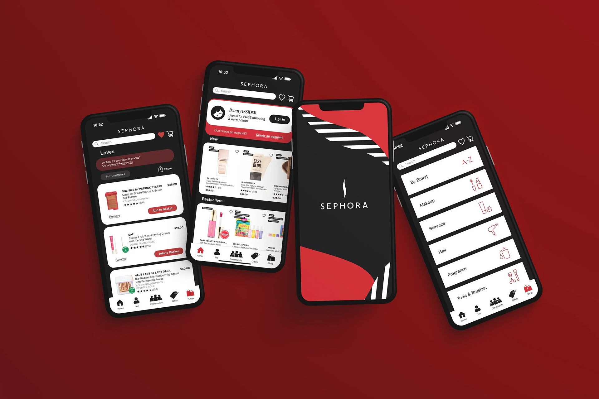
final product
I saw an opportunity to create a stronger connection between Sephora's digital experience and its recognizable brand presence. My redesign introduces bolder visual contrast, more intentional use of Sephora's iconic black, white, and red palette, and a navigation system designed to feel both elevated and approachable.
The result is an experience that feels more aligned with the excitement of shopping in-store while making browsing, discovery, and purchasing more seamless for users.
Key Improvements:
- Strengthened visual hierarchy through increased contrast and clearer content organization
- Incorporated Sephora's iconic brand colors to create a more recognizable experience
- Simplified category navigation to reduce friction during product discovery
- Enhanced the "Loves" experience to encourage engagement with saved products
- Created a more premium and immersive shopping environment
- Improved discoverability through cleaner layouts and stronger visual cues